Web versions (1.0 vs 2.0 vs …)

Some weeks ago I found in my room of my parents’ house a book about programming Java, mainly focused on applets. Applets are small pieces of software which can be included as a part of a web page. It’s funny, plus interesting, to read the introduction of this book (written 9 years ago, when web was 1.0), which claimed java applets as the key point of the future. “People will not use desktop applications, but java applets”. Nowadays we don’t use applets (except in some particular cases, like Processing or KGS). The predictions have not been accomplished.

Now we live on the Web 2.0. My personal description about the new version is:
Web 1.0 – It was created to share knowledge, information.
Web 2.0 – It was evolved to share emotions, feelings.

It seems perfect. But you know it’s not. Now a lot of people is predicting a future with web applications (like Google Calendar) and social communities (like Last.fm). The question is that now we have a perspective, and we have seen that some predictions from the past were wrong, so we can guess that most of what the people are defending now (in the name of Web 2.0!) will not be here in the future.

The Web 2.0 has some hidden problems, and little by little they’ll emerge.

For example, questions about privacy. Most of the social websites offer you a lot of functionalities, but in exchange they require you to show some of your personal stuff. Why do I want to show what I’m listening now (in Last.fm) or my last travel pictures (in Flickr) to everybody? I know there are options to hide some of this information, but even so, I have met people who have decided (for example) not to publish their baby pictures in Flickr because they are “not sure”.

Web 2.0, let it be, let it evolve!

Meanwhile we should start thinking on a bigger step: Internet 2.0. A new Internet protocol version, trying to avoid SPAM, Deny-of-Service problems, and creating new algorithms to increase the efficiency of the communication lines use.

Thoughts about Icons on User Interfaces

Bathroom heater's icons 
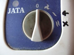
What do you understand from this picture?
It’s the switch of my bathroom heater. It has 4 positions: 0, fan, 1 and 2. It’s easy, isn’t it? Even though, last week I had to open it to try to repair it, and I discovered that one of the two small radiators, it has inside, was not working. I tried to repair the damaged one, but finally I gave up. So I drew two black icons next to the switch, an arrow and a cross, to inform that only the position “1” works.

Surprisingly, my flatmate didn’t understand it. It is easy for me: an arrow is marking the correct choice, and a cross is marking the wrong one. But somehow it’s not as easy for other people, who have not a wide knowledge about “User interfaces”. This is a quite interesting question to think about, when we are creating UIs: “is the user going to understand the interface?

Combos squaresA trivial example. Look at these two boxes. You can guess the first one is a combo box, or drop-down, or something like this. The second one seems a text box with a drag-and-drop element. Can you see it? We decide the second box is drag-and-drop because it has four arrows instead of one arrow (or this triangle representing an arrow head). Honestly, it’s totally ridiculous!

The essence of the question, when you are working on an UI, is to assume nothing. Quite difficult anyway.

Half glass

Some people say the glass is half-full.

Other people say the glass is half-empty.

An engineer says the glass is double the needed size.

SVG: The vectorial graphic format… for the Web?

If you can read this, your browser cannot render “Scalable Vector Graphics”… get FIREFOX or OPERA

I’m learning to use Inkscape, an open source application to draw graphics. It saves your drawings in SVG format. For some reason, I’ve discovered that this format is a really interesting standard for the future of the WWW. The Scalable Vector Graphics (SVG) is an extension from XML to define, as its name says, vectorial graphics. The W3C standard is quite wide, with a lot of options which define from simple circle shapes to text following a curved path. Because it is XML, you can open in your text editor and see the source (try to see the source code of the image/frame above, if you can see it).

As you can know, nowadays there is not a free option to use vectorial graphics in websites. The only real choice is to use Flash, which is a propietary technology (with the benefits and problems which it carries). Another option, a bit weird, is to use java applets to draw in the screen, but it seems like overconsuming resources without sense.

The good news is that Mozilla and Opera are working hard to support SVG. In fact Firefox paints SVG quite well. But there are more: you can use Javascript to change the elements inside a SVG, like DOM Objects, so you can create animations, add events, and such things. And even more: being vector graphics you can resize without a loss of quality; it supports creative commons definitions; the texts within it can be indexed easily by Google (because actually it’s XML); and so on.

The bad news. The guys from Microsoft are too busy to think about SVG support. Internet Explorer 6 cannot manage SVG, neither does IE7. And they have no plans about it. Why?

A moment where everything changes

Woman B/WIt’s just a point in the time line. A sigh, the past disappears and the future emerges. You are having a cup of tea and suddenly you realize that you’ve already decided to change your life. In fact you can not decide to change, but the change arrives to you. Can you really decide something, or the only thing you can do is to watch the changes coming? The turning point has arrived, and now the colour of the world has another tonality, it evolves from black and white to full saturated colours. You have no option but to swim in the hue, tasting the green tea you’ve been drinking, jumping over the fence.

Welcome to a new state of electricity in your brain!

Discovering potatoes on my own balcony

Weeds on my balcony?Some weeks ago it was quite rainy in Barcelona. We had some continuous rain, and it’s a bit strange. On my balcony something green started to grow in a small rectangular pot that we have there. I thought they were only some mint plants, but when I tried to smell their leaves, I discovered they smelt of nothing. “Hmmmm… weeds”, I concluded.

Today I’ve decided to remove them… and when I grabed the first of them and pulled it out… what a surprise!!
Discovering potatoesA big potato (like 4 fingers wide) and lots of small potatoes. I’ve never thought I’d have my own potato harvest (inside a city with 3 million habs). Amazing!

I’m thinking about building a big pot, made with wood… to grow more potatoes. I want more 🙂

If only we could develop things as nature does!

Boys and girls on Internet

SexsThis week I’ve read some texts about men and women on Internet. To start with, “most bloggers are women“.

“According to a survey of more than 4 million blogs by Perseus Development, 56% were created by women. More bad news for the boys: men are more likely than women to abandon their blog once it’s created.”

If we admit the premise that blogs are one of the most important sources of new information on the net, we might guess that nowadays there is more text data from girls than from boys on Internet. Interesting! It’s known that each sex thinks in a different way, therefore it’s curious to read the world from the other perspective. Even so, there are people who still study the intelligence in number’s concepts, and somebody claims that “men are more clever than women“, although in practical terms there is no difference. Sometimes men and women think and understand things in a different way (like in this clever joke), but in most of the cases we can do the same things.

However, in the “tech professional” world you can hardly see a woman. At University I saw almost no girls in the Computer Science Faculty. I don’t know the reason, but I can guess it’s still a question about social roles (boys play with computers, girls with dolls). Anyway I know things’ve been changing during the last 5 years, and now girls are more likely to enter in technical studies. Even Google is supporting girls with special grants (read in Ana’s blog). I hope to see more and more women in tech positions… I want to see a new algorithm made by a girl… I want to fall in love with one of them (“damny dangerous”, but it’s worth it ;-)).

The web is not to print, but to scan

This week I have had a lot of dead time in the office (while waiting for the client’s answers), and I’ve been reading some web usability articles from Jakob Nielsen’s website. I have read almost every column he wrote, and I think I already knew most of the key issues (like colors for links, big fonts, etc). He writes using the common sense, so it’s quite easy to arrive to most of his thoughts on your own. But I’ve also discovered some interesting ideas, that are letting me think about it… and I want to comment one of them: We scan web pages, so we don’t need perfect design.

In the office I’m surrounded by a lot of graphic designers, who spend most of the time building “perfect” designs. “Pixel perfection”. Everything perfectly aligned. Later we spend a lot of time translating them to HTML and CSS, keeping these exact pixel measurements in every known browser. I see some of my coworkers spending a lot of time making CSS hacks to fix such small design problems (and becomimg proud of this). Is it really necessary? Internet is not a print medium, where everything has to be in a perfect position. Internet is a place to look for information, where we scan pages, quickly. Of course, the look & feel of a website is quite important, to help us to figure out at sight if this is a “good or believable” place. But it doesn’t matter if the menu is moved 1-pixel to the left if you visit it with Explorer instead Firefox. Because what the user really want is information, served in an easy way to find out.

Hey girl, you look so pretty, but do you have something inside your head? No? Then the most you can aspire is an one-night relation, and the next day he will not remember you. Sad but sadly usual.

Update: I see these ideas, concerning to avoid working on pixel perfect positions, over and over. The last time that I’ve seen them, it has been reading “A List Apart” lastest article: “12 Lessons for Those Afraid of CSS and Standards“, where the author refers to these ideas several times.